QUESTION ONE
In what ways does your media product use, develop or challenge the codes and conventions of real media products?
My media product uses, develops and challenges the codes and conventions of real media products in a variety of ways.
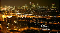
Using my audience research (see Questionnaire Three – Documentary), my main product was produced in a manner to apply several tropes expected by my prospective audience to be seen throughout similar industry articles. Firstly, I included only a singular narrator, a convention stipulated by every documentary reviewed in my technical analyses. Alongside this narration, I also featured music, once again something featured in almost all of the analysed texts as well as expected by those who responded to my questionnaire. This music was chosen to be a purely instrumental version of a popular song, so as to avoid lyrics interrupting the flow of narration. Aside from sound, my documentary featured several other similarities to real media products. Several shots of an area taken using a variety of camera angles, as well as key establishing shots of banks in particular, were shown initially to establish topic. This also coincided with the information supplied by n
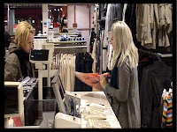
arration. This continued to narrow towards more specific imagery, namely shots of labouring in shops, correlating with the narrating facts supplied regarding unemployment
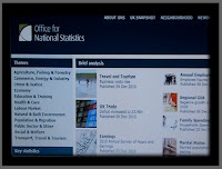
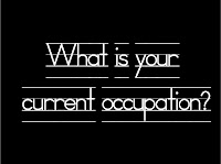
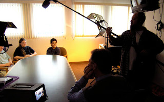
. Following this, statistics were portrayed as evidence to supply weight to the argument of the narration, taken from a reliable source. This is a common technique in both media products and written discourse to act as a persuasive technique, rather than have the supplied opinions passed off as nothing but speculation. I also included an interview, featuring captioned questioning and a vocal introduction of the interviewee. The documentary was concluded within the time-scale of this interview, which was filmed in static medium shots, which might be debatably untraditional. My logic behind this decision to keep ca
mera movement during the interview to a minimum was to both apply a more dramatic tension, as well as to boost prospective focus towards the dialogue rather than any visual stimulation. This choice was similar to my decision to film the vast majority of my product using the camera hand-held – perhaps unconventional, although my argument for this decision would be that I intended to supply a less corporate or clinical perspective to the issue, an issue that involves and applies most prominently to the general public, using hand-held footage to place the viewer in the midst of proceedings.
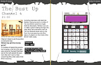
My print artefacts were arguably less conventional, particularly the spread for the Television Listings magazine. This somewhat abstract design was however intentionally unconventional, intended to draw the focus of any perspective reader flicking through the magazine casually, expanding my target audience significantly towards those who might previously have never heard of the product in question. This bold design was achieved by an abstract border and stark black and white contrasting. Conventionally, the magazine spread features a large title and images relating to the show, as well as Channel 4 specific facts in black blocks for those merely intending to skim the main body of text, as well as the date being featured in the top corner of each border.

My second print artefact was conventional in many aspects. It featured the title of the show, the date, a relative image and the time of the anticipated broadcast. It was designed to incorporate the same font as featured on the Channel 4 website. Its imagery, although unconventional in itself perhaps, was abstract and peculiar enough to stand out amidst many other blander designs, as well as to remain within the limitations of many other Channel 4 advertising campaigns – often noticeably more edgy and arguably varied than those of competing broadcasters.
QUESTION TWO
How effective is the combination of your main artefact and your ancillary products?
My two print artefacts in particular feature many similarities retaining the common theme. An image previously discarded as a stand alone advertisement was recovered and placed on the right hand side of my magazine spread, a correlation clear yet varied between the two in their finished forms. Alongside this comparison, they both feature the conventional Channel 4 font, not only an effective combination between both artefacts, but with the broadcaster itself. The title and date/time of broadcast is shown clearly in both, more abstractly in the advertisement arguably.
With regards to the effectiveness of their combination with my main product, the documentary in question, I would say that the three products work well as a whole package in general. The prospective audience of the Four Network, Channel 4 included, is that of teenagers upwards, and although my product doesn’t capitalize on the lower end of that spectrum, the use of bold imagery on both of my print artefacts correlates well with the use of a relatively young narrator. The main product feature’s quick edits and fast-paced narration to maintain the theme of a young-adult oriented audience, as does my limited usage of wording in my magazine layout, as well as the utilization of more contemporary font styles in all three of my products.
My print artefacts both feature imagery that might arguably be particularly publicly accessible – a calculator being an item that practically everyone within the UK has at some point used, and thus immediately identifies connotations of mathematics, therefore only a logical step away from the economy given the tabloids of recent years. This style of blunt, straight-forward presentation – the product is what it is - might well be said to be reflected in the styling of my documentary, featuring little by way of special effects or convolution in general.
QUESTION THREE
What did you learn from the audience feedback regarding your product?
My main product, as well as ancillary products, received generally positive feedback on a whole. Few suggestions for improvement were unviable – an example of one that was being to film a second interview, impractical both due to time constraint and with regard to the product planning. One suggestion was made to suggest a more meagre usage of transitional effects between slides to supply greater professionalism, which was taken on board, several being removed entirely, or otherwise replaced with simpler transitions such as fades and slides. This was done in order to better appeal towards the codes and conventions of a documentary, as the majority of the product did so and to have a stand-alone feature such as transitions be unconventional created a less fluent production overall. Another criticism that I initially perceived to be an unviable suggestion was to improve the framing and presentation of shots by greater capitalizing on the use of a tripod in order to steady the filming. Despite filming further footage being an option unavailable at that point, this issue was addressed by feathering the majority of the frames, giving a slight blur to each edge and supporting the intention of the hand-held camera work to begin with – that it was done so intentionally rather than by way of simply lacking the required equipment.
A second response to review was to simply alter the order in which several clips were shown, creating a more innovative approach to information representation in response to the comment that greater imagination was required to bolster the product’s impact.
Little criticism was made of either of the two print artefacts, although a noticeable suggestion was that both could be brightened, which on reflection was a valid criticism and easily one easily rectified.
QUESTION FOUR
How did you use media technologies in the construction and research, planning and evaluation stages?
The incorporation of a vast variety of media technologies was essential to the success of the production process.
One of the most prominent uses of technology within the planning and research stages was the creation of the blog by creating an account on blogger.com, or otherwise adding an all new blog to a previous account. This was followed by the decision on which design template to feature in order to supply the greatest aesthetic relevance and effect, as well as the alterations made personally to the pre-existent template to better showcase my planning and research, for example font colours and styles.
Several of my technical analyses were produced with the assistance of both Youtube and 4oD, accessed to view the content I wished to assess. Several clips from Youtube were also embedded onto the blog itself with relation to their analysis, using the code supplied beneath the video itself. Static images were uploaded using blogspot’s internal upload system, and positioned similarly in accordance to my own aesthetic preferences. Several of these images were themselves found by way of the internet after performing a Google Image Search, saved from their onto the computer, and from that point uploaded to the host blog.
Construction relied almost entirely on the use of several technological aspects. The footage for my main product was filmed using a mini DV tape and a digital camera. From there, it was uploaded onto a computer by use of a tape-deck and the Log & Capture system, in which unwanted footage is easily discarded and separate from footage I wished to keep and utilize in my production. This footage was then edited by the usage of Adobe Final Cut Pro, using the internal toolkit to manipulate, position and essentially alter my recordings from raw footage to a viable production. This was enhanced by the use of many transitional and filter effects supplied by the programme itself, including the incorporation of text.
Once again by way of Youtube, the song featured throughout the first half of my production was downloaded after being featured alongside a video. Using Adobe Soundtrack Pro, this track was separated into layers in order to remove the vocals yet sustain all instrumental contributions, and following this, the edited version was exported to ‘Final Cut Pro and incorporated into the production.
The original images for my print artefacts were found through the aforementioned Google Searching as well as directly copied and pasted from websites such as Channel 4’s own. This was also made possible by use of the print-screen key, from where they were pasted into Adobe Photoshop or Microsoft Paint respectively, reduced and trimmed of excess features using the Crop tool, and eventually exported to Photoshop. From there, several images created via the process noted above were collaborated, each forming a separate layer, and adjusted in terms of colour, contrast, brightness and definition, as well as use of the Eraser, Paintbrush and Pencil tools for minor alterations. Several of these individual images were also altered using the Effects available, for example to take on a more artistic and stylized aesthetic, also achieved by use of the Liquefy tool in which certain edges were drawn out and blurred, essentially to supply better cohesion between otherwise contrasting images. Eventually, each of these individual images where combined, Grouped to form a New Smart Object, and saved as two file types; the first, an Adobe Photoshop Image, being of a higher pixel quality but, thusly, a far larger file, and the second, as Jpegs, far smaller files and of a generally lesser quality, although more practical due to the upload limits of images intended to be featured on my blog. Several of these images, drafts of my print artefact, were also converted to jpegs in order to better function on Microsoft Computers and transported by saving them to a memory stick.
The various aspects of the evaluation process have required technological contributions in many ways; the embedding of images onto the blog to correspond with topics of current discussion, for example, another being altering each of my individual products after audience feedback.
The progression of skills required regarding technology has also been substantial. To produce each product to the desirable standard, improved knowledge of image manipulation was required, both through familiarity and understanding of the many available options within Photoshop as well as a greater comprehension of the inner workings of Final Cut Pro. Without substantial progression with regards to my knowledge of either of the above, the eventual outcome would undeniably have been significantly worse.






 st.
st. 